Nomado
A story behind the brand and interface design of online bank for travelers and digital nomads
client and problem
Nomado is a travel startup born by the collaboration of professionals from tech and banking industries. The company has a strong dev department but the design language was weak and kit-made so that they had a risk of getting lost in the pool of competitors.
design solution
Our goal was to provide a strong visual language and help Nomado to stand out and get the appealing look & feel which resonates with a target audience and gives a feeling of joy and safety during product usage. Also, we needed to introduce the product to potential users.
Analysis
To beat the monster, we had to draw the monster. That's why we dive into deep product analysis, detected and prioritized the following issues:
Wrong distribution platform choice
Lack of Flexibility in the Development Process
Chasing competitors on a new growing market
No landing point for a potential customer
Outdated look that doesn't attract new users
Roughly Set Target Audience
Mobile First Travel Bank
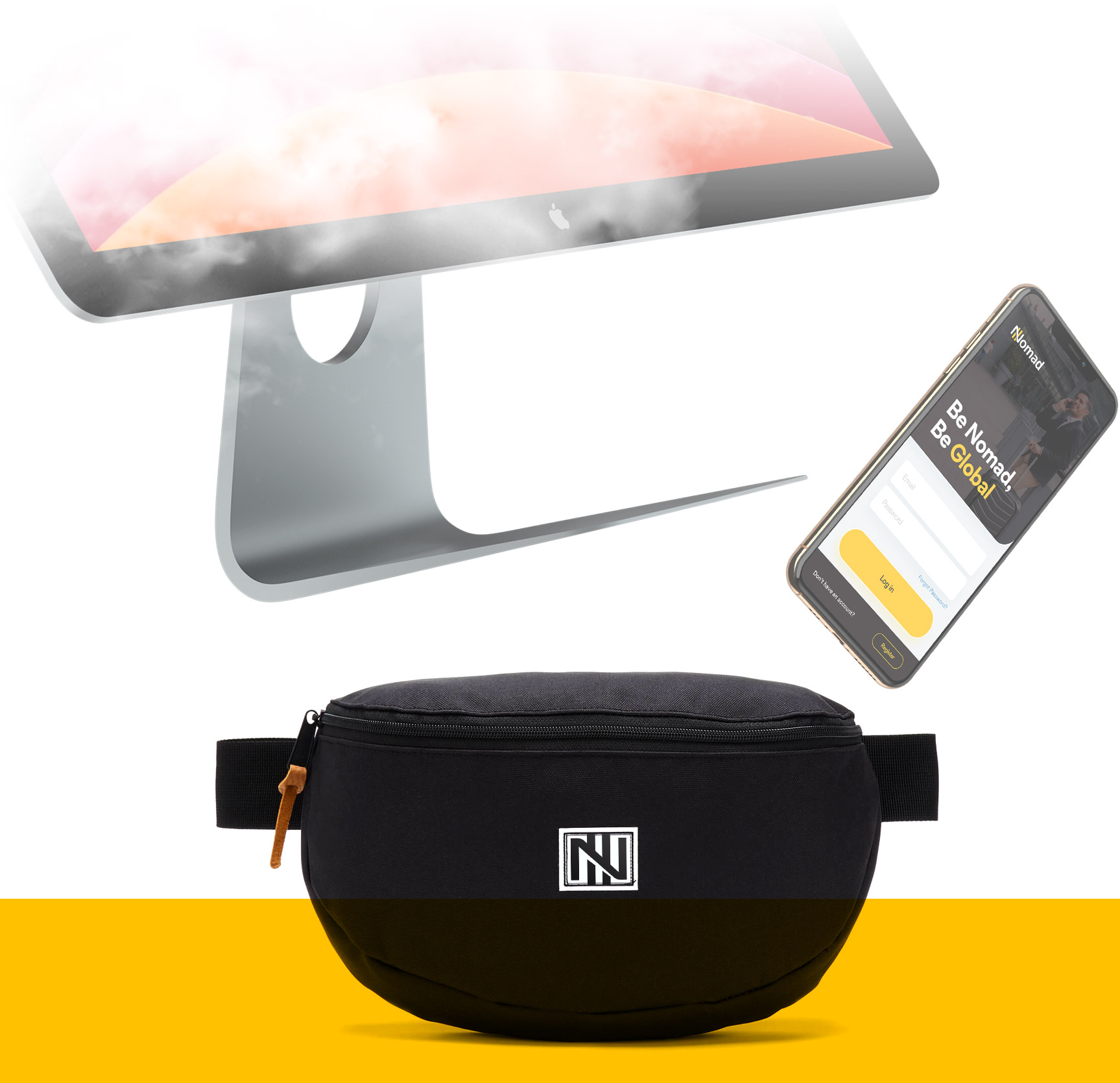
Getting more information about the target audience of business travelers and digital nomads made us suggest the Team change the direction of the product to become a mobile-first platform. A smartphone is a thing every person own so the product will spread faster and the platform engagement is going to be increased dramatically. And that's what we aiming to, right?
How did we beat the UX issues?
Wireframing was the core action to get sure we're moving in the right direction and give the organic transition to mobile platforms. That's why we created a raw clickable prototype to see how the app should work.
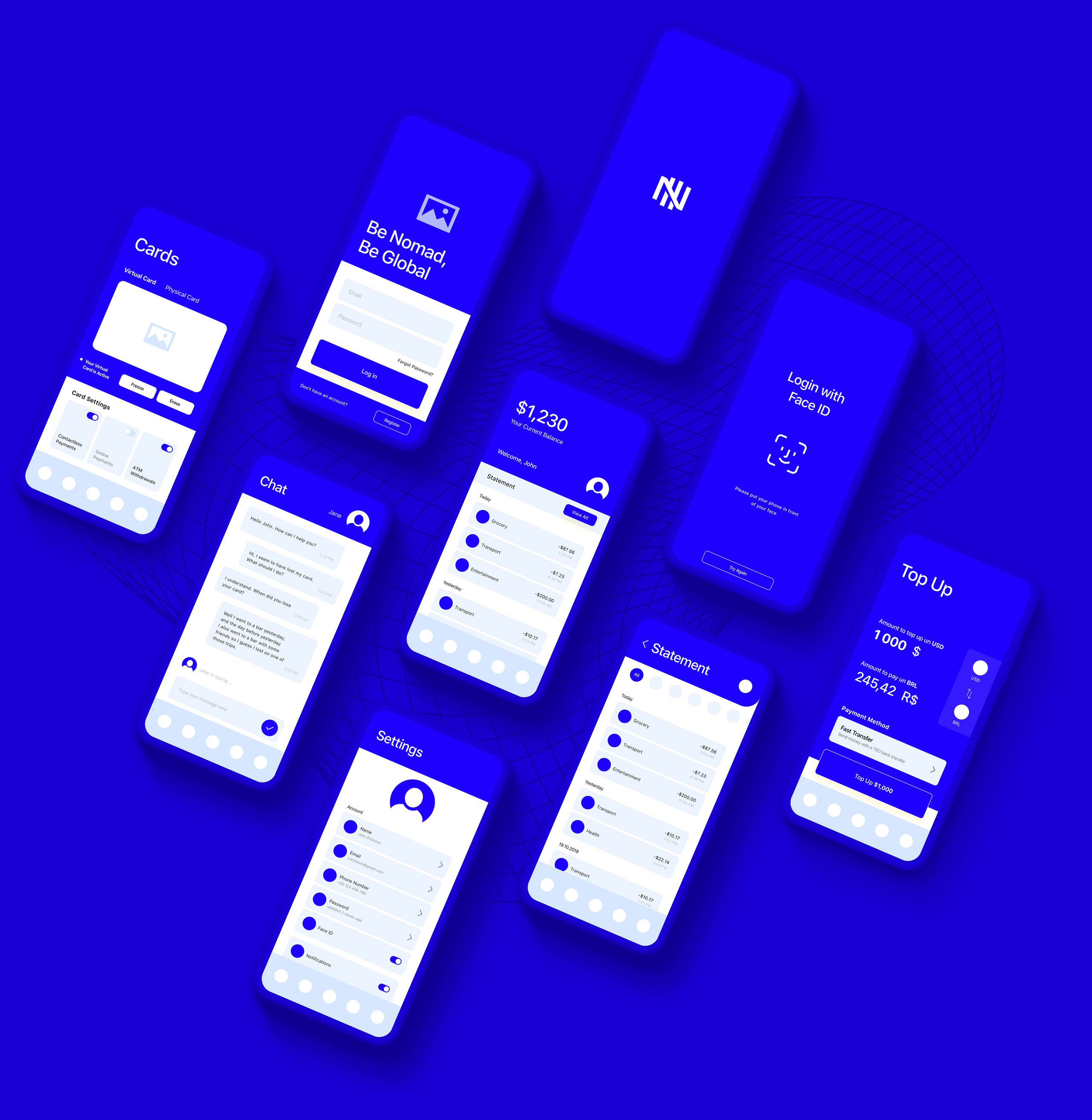
It could be not a popular opinion but prototyping is not a must in many cases. But here we had to ensure we haven't missed any of the functions and flows
Brandify
You have a product but brand is something over. We know some tricks not only how to give your app a good and conscious look and feel, but also make users get the right feeling by using it. Here are three core components every product should have to succeed:
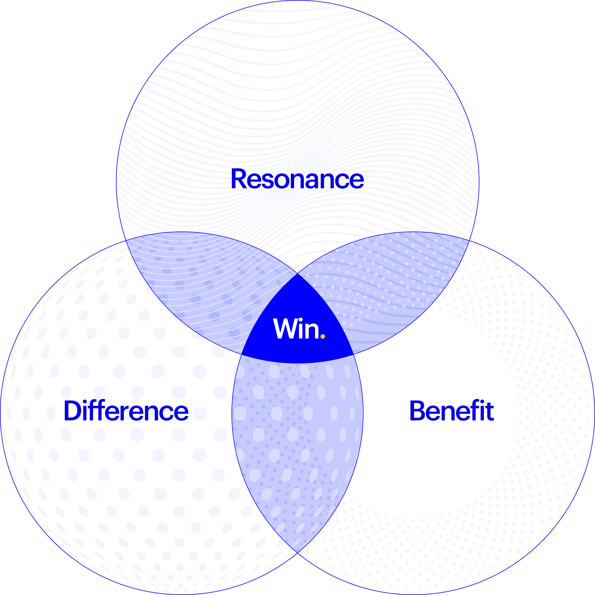
The benefit is what Nomado team covers completely so let us focus on the first two.
resonance
The look of the product should speak the same language as the user speaks. That's what allows customers to use the app organically and get connected.
difference
The app should stand out from the mass of similar apps to get noticed. It is a time of very fastly growing industry so the product needs to be different to get additional value
Deal.
Intro
Before going live we've made a one-page placeholder to collect user's interest before the release. That allows us to collect some core of fans and leads even before the product is launched.

Fast and Flexible
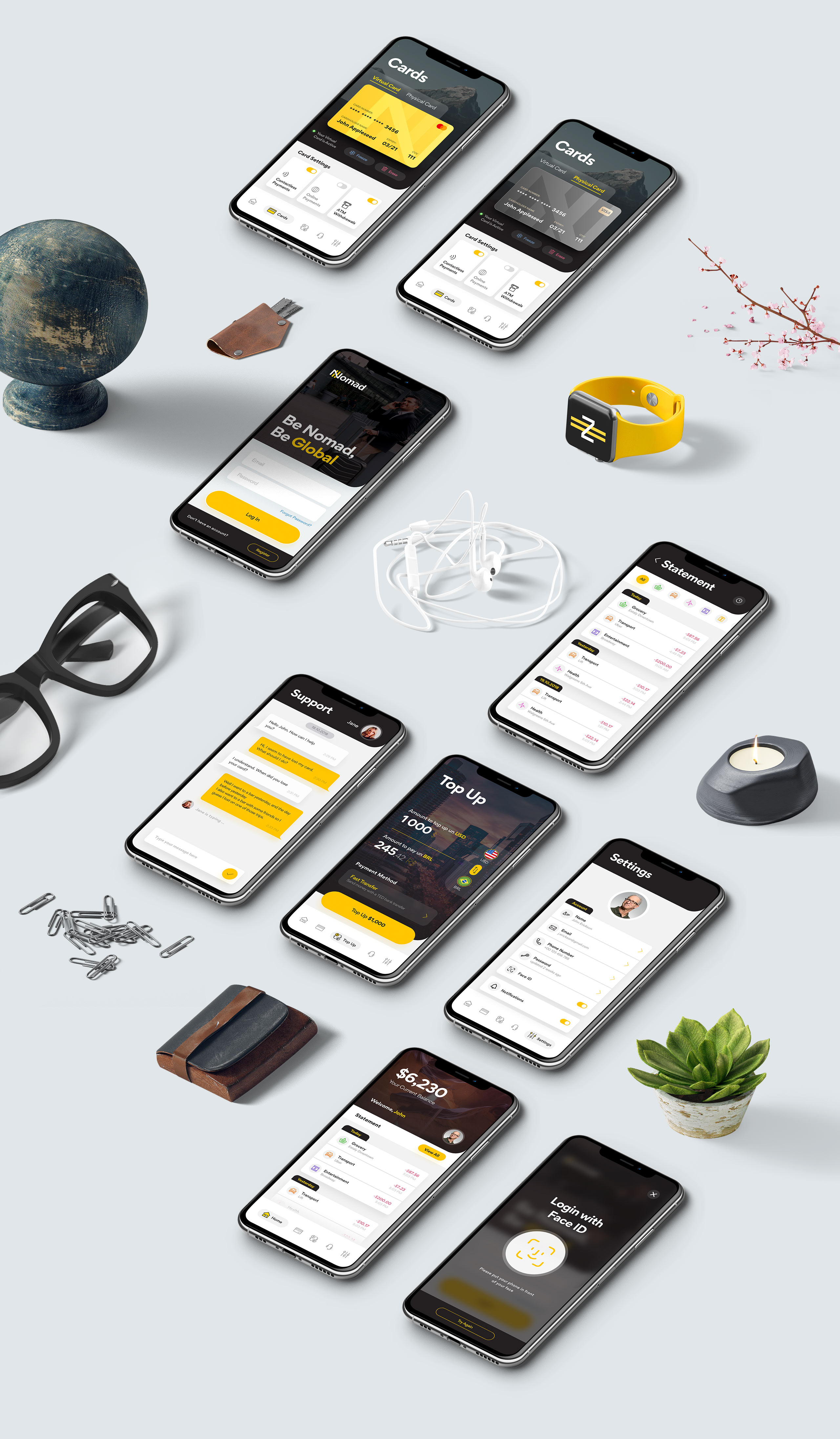
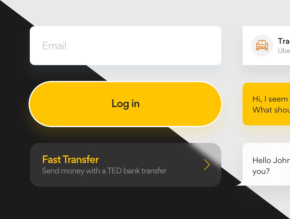
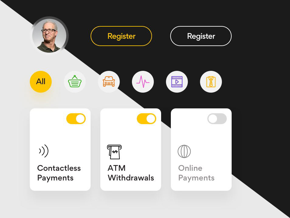
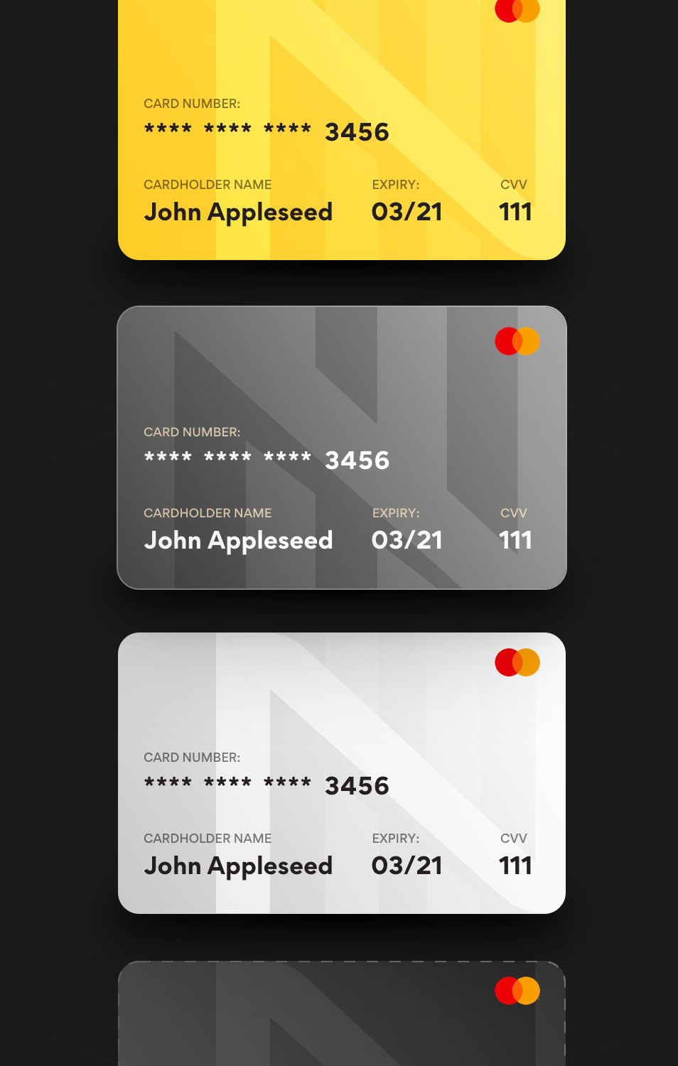
Besides pixel-perfect screens, we've also delivered the complete elements library and guidelines which help the development team to be flexible and quickly build new screens with pre-designed blocks. That is what gives an ability not to spend the time on negotiations and make new pages and functions quickly which is a competitive advantage comparing with other product teams.
Finally
At the finish line client got an appealing and well-designed product that attracts users and stands out from the mass. It delivers a seamless experience to new and existing customers and ready to take its place on a market.
Product got a resonance with an audience
The landing point for new customers attraction was created
Took a personal niche with the ability to be the top-1 here
A new way of spreading the service and sharing the value
Countable time and money savings on dev process
Creation and test of new features is not a pain anymore
Let it happen
Drop a line about your project goals and let's discover the fastest way to reach them